
Mobile is leading the digital age and is ‘THE” device of the future. Building a mobile-first website is not a new idea; it is a necessity.
Mobile SEO is optimizing a website for mobile devices to improve its ranking in search engine results pages. This is important because more and more people are using their mobile devices to access the internet, and businesses need to make sure their websites are easily accessible on these devices.
Here is mobile usage data per smartphone worldwide from 2019 to 2027 by region.
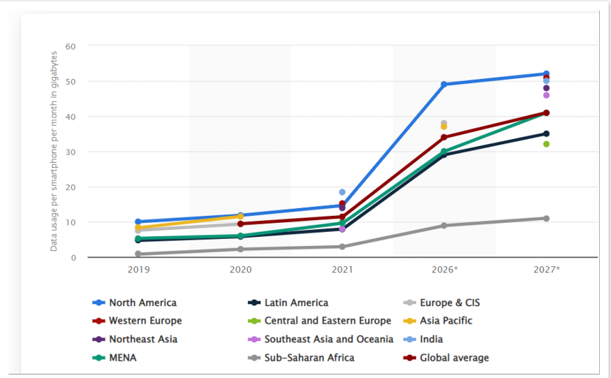
Source – statista
The data above clearly indicates where we are heading and why optimizing for mobile(smartphone) is, without a doubt, a critical piece of success for all businesses.
Why is Mobile SEO becoming vital?
1. Mobile vs. Desktop: The trend for mobile devices has rapidly increased in the past few years and now exceeds desktop. That only highlights where your target customers are and improving the SEO on the devices is futuristic.
2. Contents: Your website must be designed and written for mobile devices. When indexing the content for searching, Google prefers if websites with mobile devices users in mind. The approach is mobile-first, meaning your site contents and design needs to be mobile-friendly and device independent, or you will be ranked poorly in search results.
3. Customer Base: Mobile has an excellent customer base and reaches out. It is great for people who are on the go.
4. Location: Targeting based on customers’ location is a better utilization of advertisements spent.
5. Customer Engagement: Higher customer engagement when you have a mobile site and a desktop, e.g., scheduling appointments and reminders with auto dealers, restaurant reservations, etc.
Here are a few tips for improving mobile SEO:
Please ensure your website works on all mobile devices: A responsive website automatically adjusts to fit the size of the device it’s being viewed on. This is important because it provides users with a good experience on your website, regardless of their device.
1. Use a mobile-friendly design: Mobile users have different needs and preferences than desktop users, so it’s crucial to design your website with mobile users in mind. This includes using larger font sizes, more straightforward layouts, and larger buttons to make it easier for users to navigate your site on a small screen.
2. Optimize your page load times: Mobile users are more likely to scroll through a website if it takes more time, so optimizing your website for speed is essential. This can be done by optimizing images and other media, writing less code, and using straightforward static content.
3. Use mobile-specific keywords: Keywords are the terms you will use to describe your business, product, service, and mission. Mobile keywords are different from desktop, so research is essential. Research on keywords will help you identify the most effective keywords in your mobile SEO strategy.
4. SEO prefers structured data: Google needs to understand what your pages, products, and website are about to show the relevant details in the search results. Structure data markup your website content and make it easier for search engines and users to find your website in search results which can help improve your rankings.
5. Use relevant and unique titles and meta descriptions: Titles and meta descriptions help search engines understand the content of a page and can influence how the page appears in search results. Search results show the page title tag and meta description. You must ensure the title tag and meta description are unique and relevant.
6. Ensure the website is responsive: A responsive website adjusts its layout to fit the screen size of the device used. This ensures that the website is easy to use and navigate on a mobile device.
7. Use header tags properly: Header tags improve the readability and SEO of a webpage. They are used to separate headings and subheadings on a webpage and are numbered in order. The order of tags is based on importance and helps organize the webpage. You must use header tags properly and include relevant keywords in them.
8. Use shorter sentences and paragraphs: Mobile users generally scan content rather than read it thoroughly, so simple and short sentences and paragraphs are essential to make your content more scannable.
9. Optimize images and videos for mobile: Make sure your website’s pictures and videos are optimized for mobile by using the correct file size and format. High-resolution photos or high-quality videos take a longer time to load and will impact user experience.
10. Use mobile-friendly call-to-action buttons: Make sure your website’s call-to-action buttons are easy to see and tap on a small mobile screen.
Conclusion
Mobile is the future of online search, and the amount of time we spend using them is increasing exponentially.
These tips can improve your mobile SEO, make it easier for mobile users to find and use your website, and eventually build a sustainable digital marketing foundation.
Schedule a Free Digital Footprint Audit